

66 Projects catalogued.
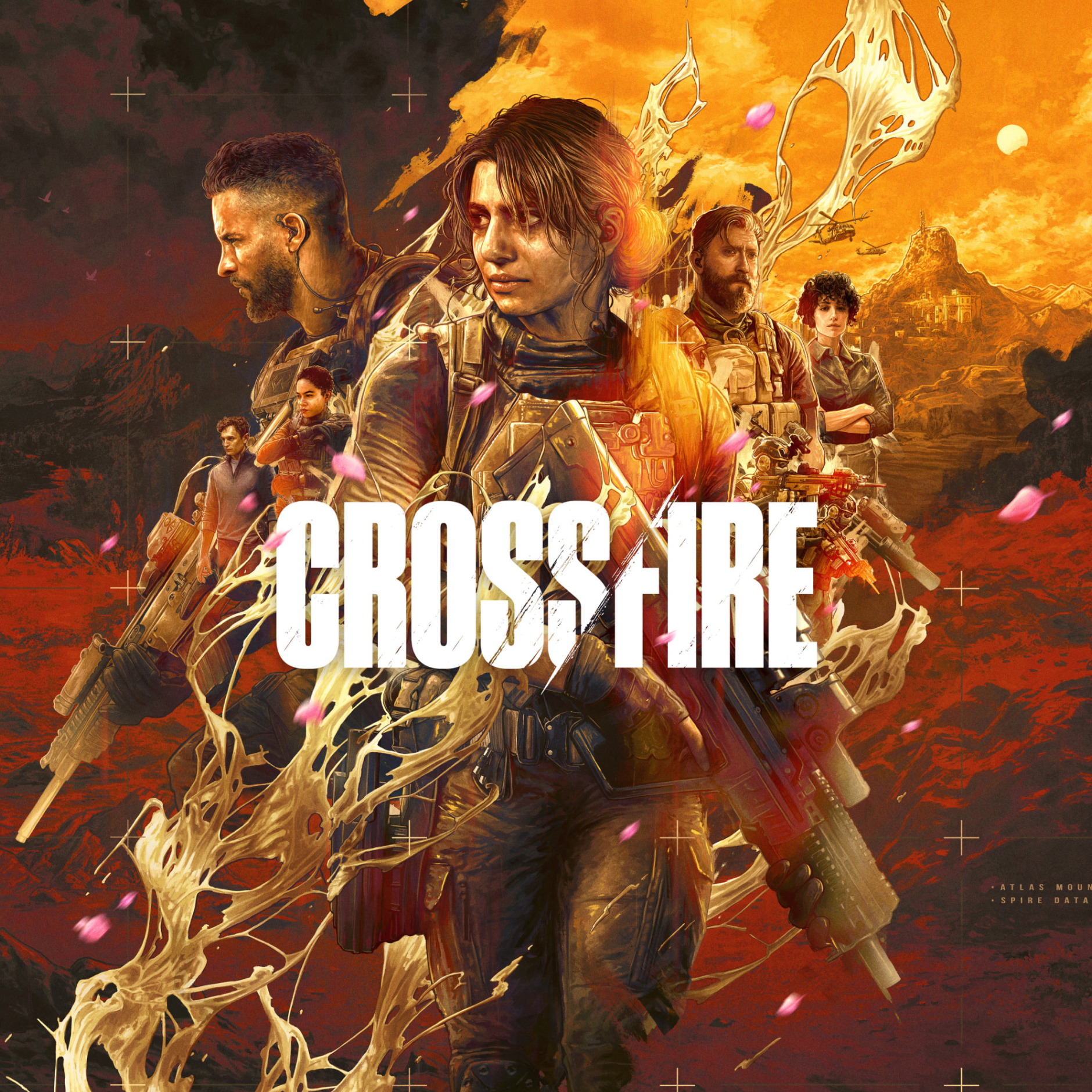
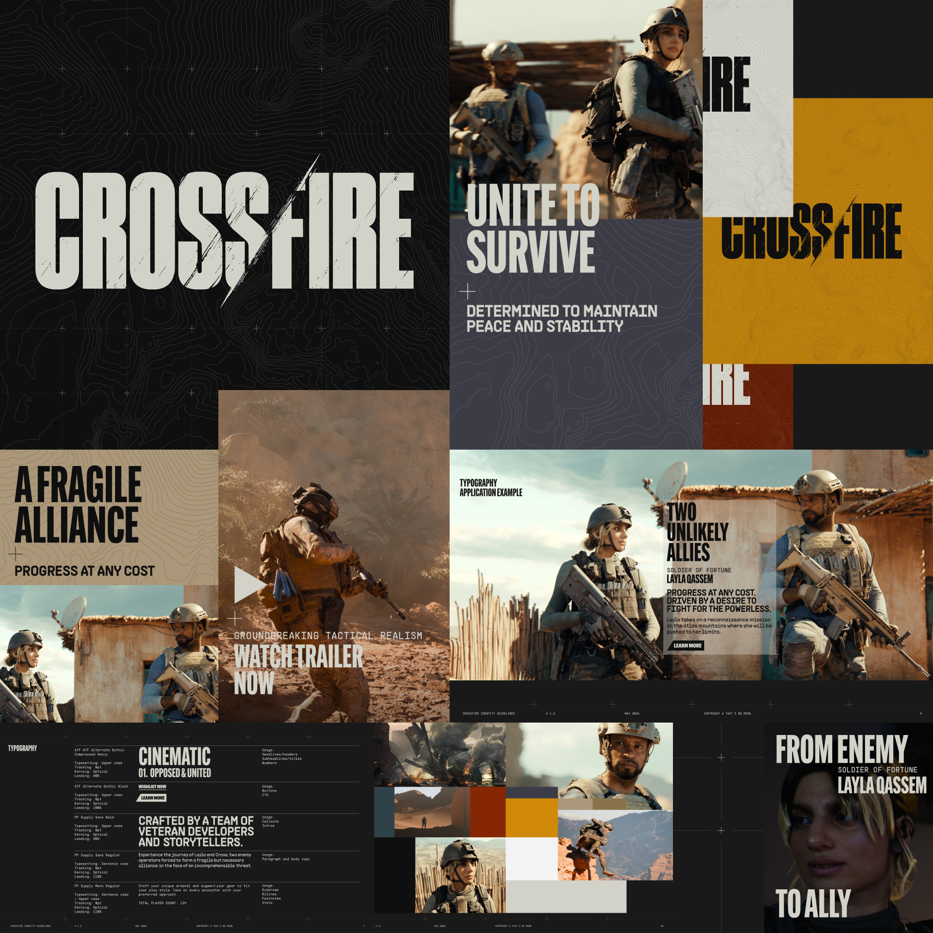
Logo design and visual identity for That's No Moon's debut AAA game CROSSFIRE, a narrative-driven action game that is set to redefine cover shooters. Rooted in the cinematic narrative, the identity is confidently paired back and typographically driven, leaning into the the visual language of topographical mapping that embraces the key experience of the game.
Key art illustration by Jake Kontou.
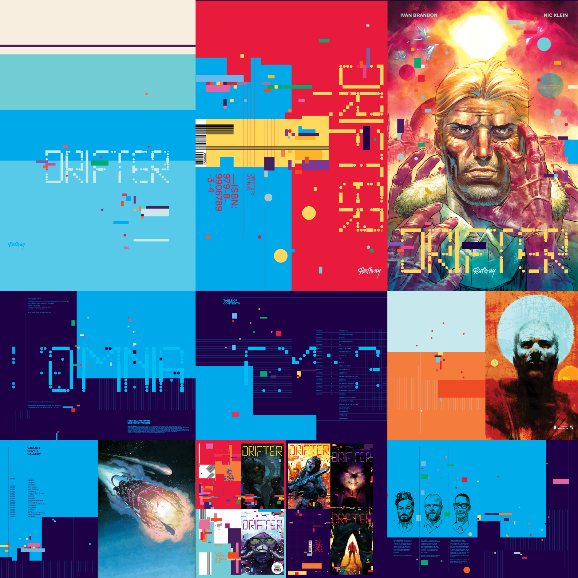
DRIFTER: OMNIA is the definitive edition of the acclaimed sci-fi graphic novel Drifter—created by Iván Brandon & Nic Klein. Originally published and collected by Image Comics; the OMNIA format collects the full story in an oversized 500 page slipcased hardcover with spot gloss, fluorescent inks and die cut finishes.
Redesigned and rebuilt from the ground up and evolving the original series design and identity, DRIFTER: OMNIA is an oversized print object that reaches for the stars.

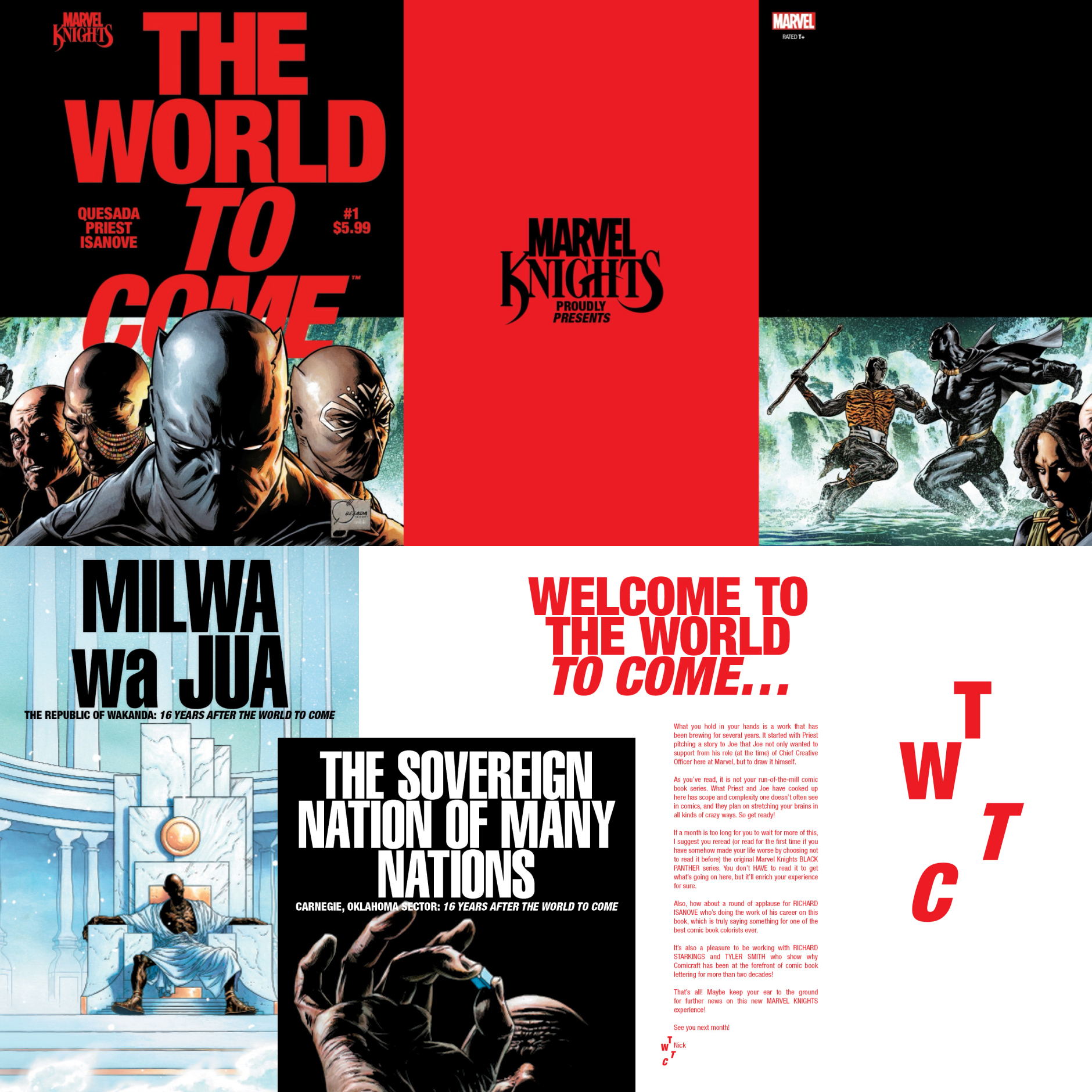
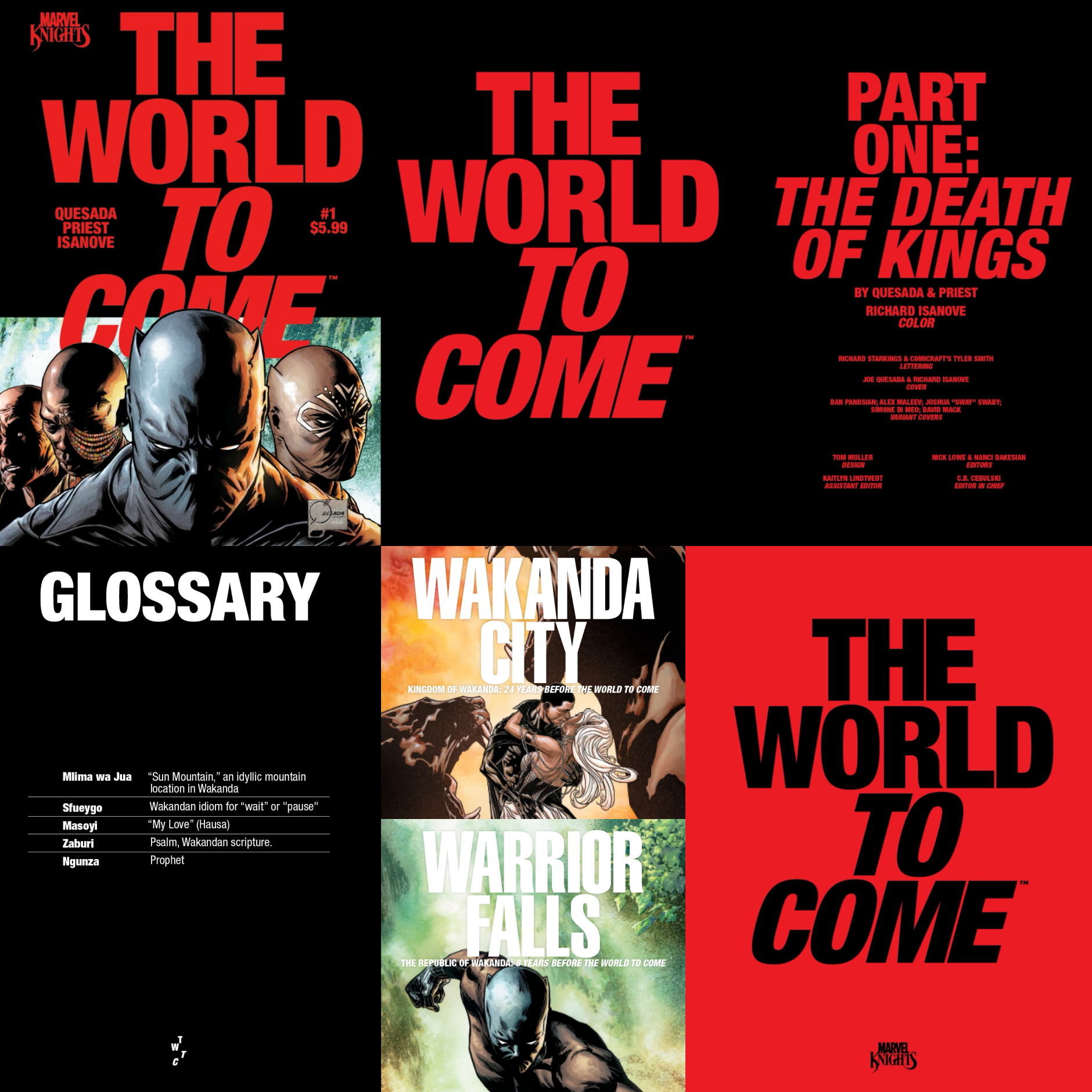
The future of the Marvel Universe brings back the legendary Marvel Knights imprint with THE WORLD TO COME. Setting apart the series and the imprint a strong type-focussed visual expression was developed that eschews the traditional comic cover approach with a contemporary design language rooted in current affairs reporting and newspaper editorial through a pop culture lens.
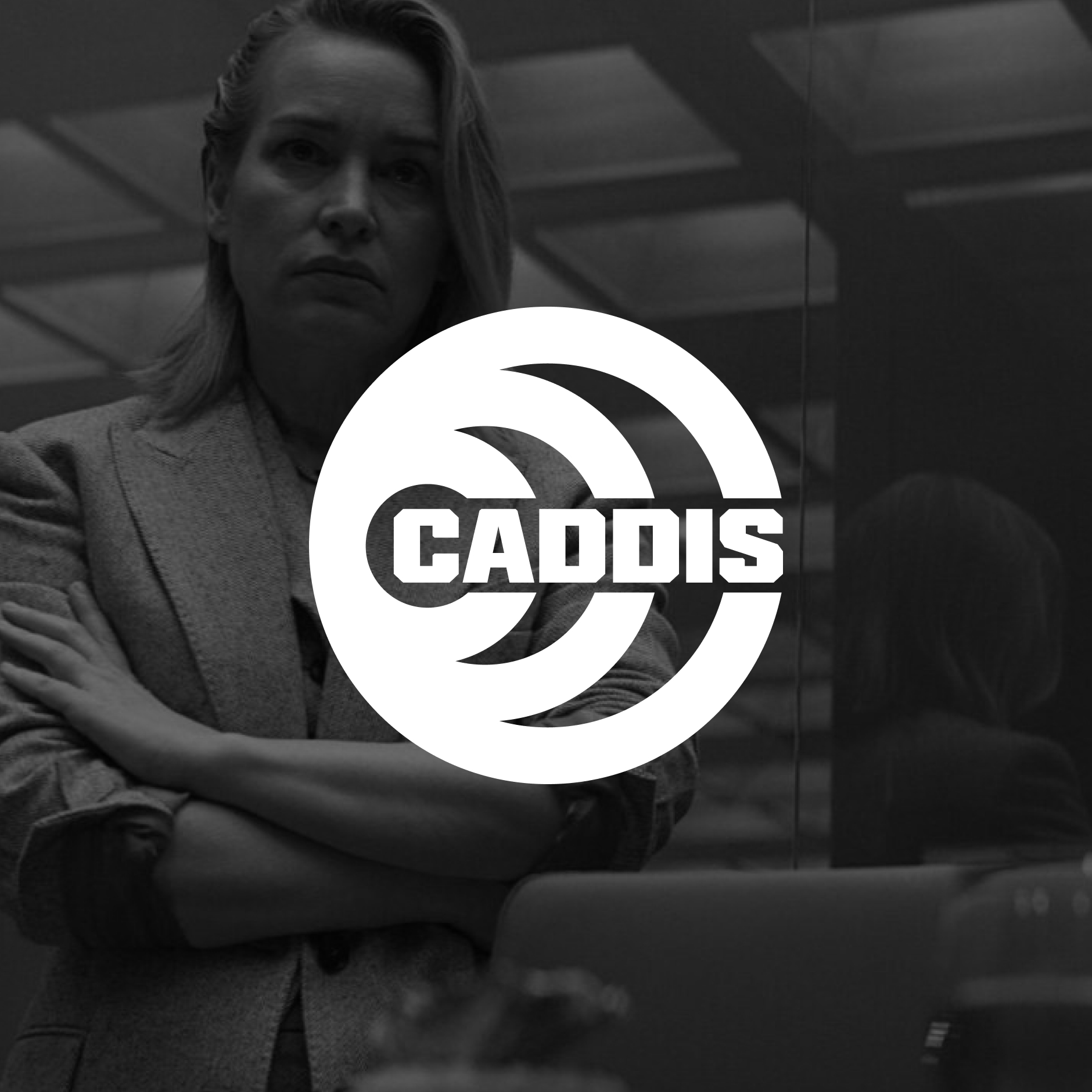
Logo design concepts for spy organisation Caddis — commissioned by Boom! Studios for the hit Amazon Prime show Butterfly starring Daniel Dae Kim, based on the comics by Arash Amel, Marguerite Bennet and Antonio Fuso.

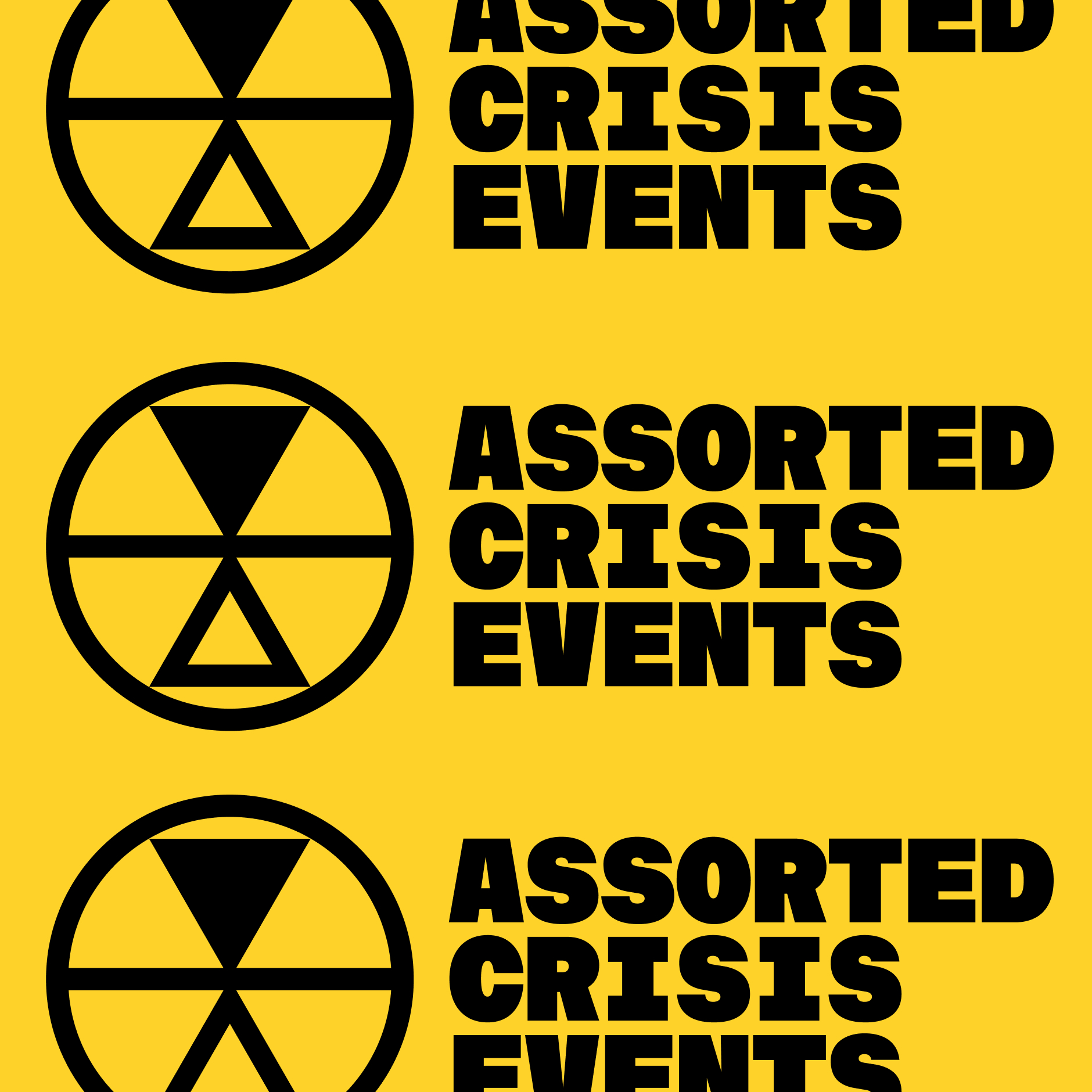
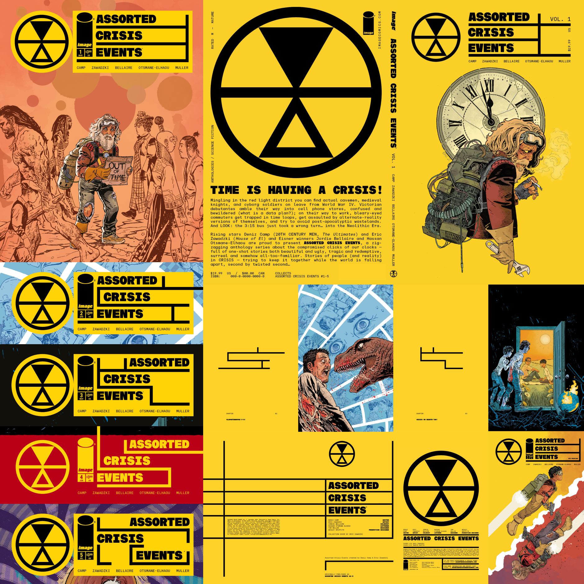
Logo and publication design for the critically acclaimed series Assorted Crisis Events (A.C.E) by creators Deniz Camp and Eric Zawadzki. The identity rooted in hazard signals, labels and iconography amplifies the distorted structure of the book, built around the series logo which is inspired by the Mmere Dane symbol, a West African Adinkra symbol that means “times change” or “time changes” and represents the impermanence of all things in life — which succinctly captures the essence of the series.
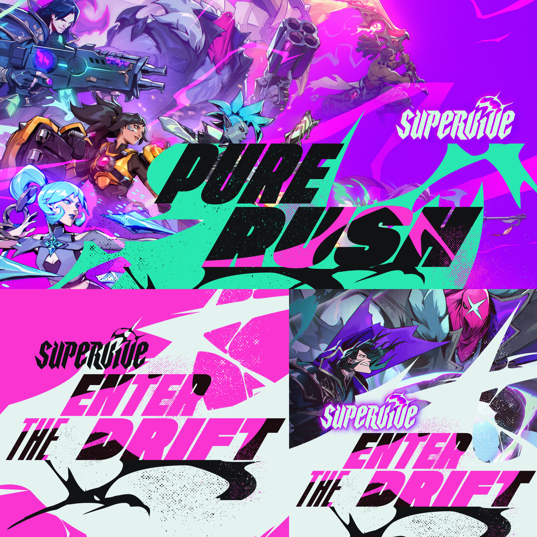
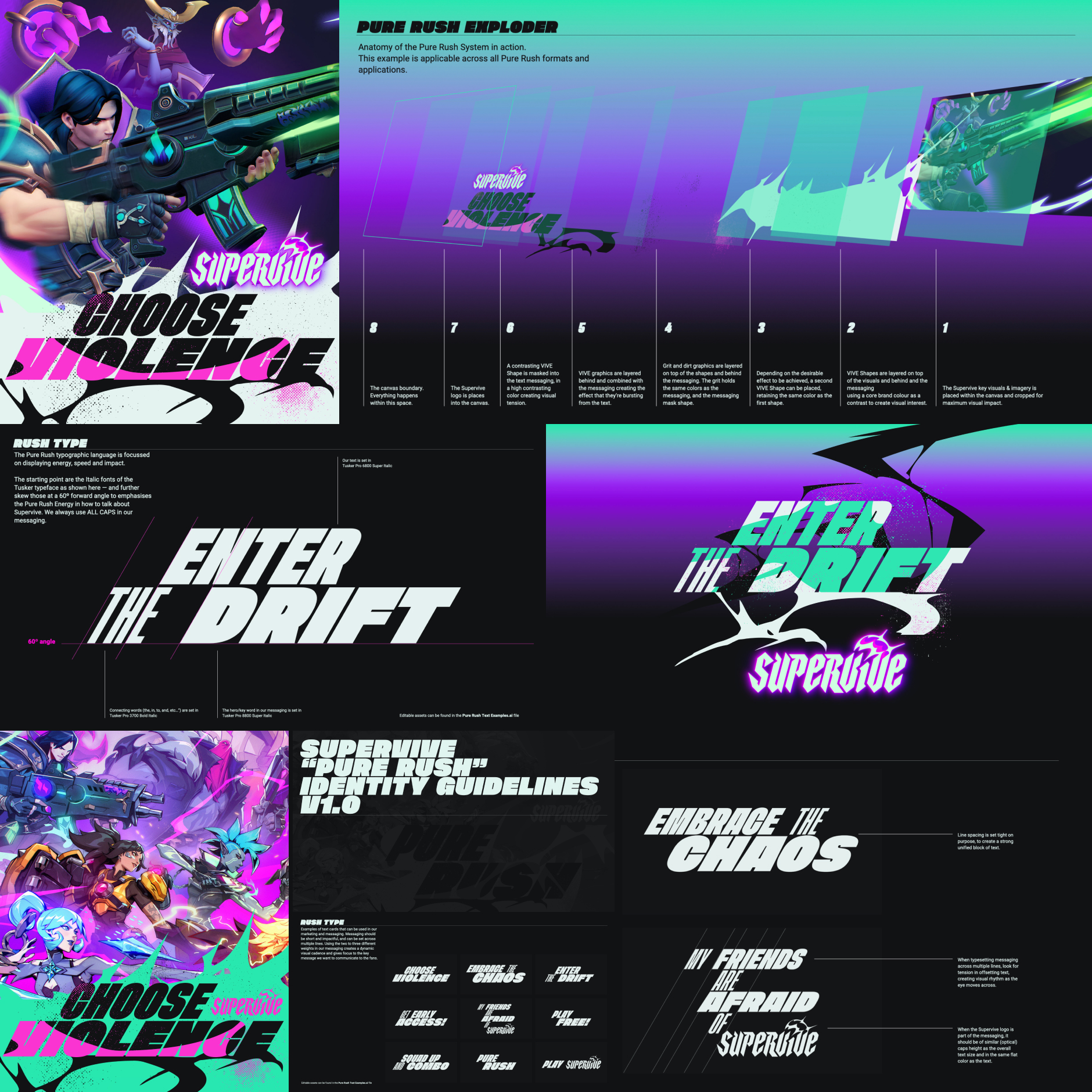
Partnering with marketing agency Summoner, a marketing identity was developed for the game Supervive, capturing the kinetic energy of the gameplay, encapsulated in the Pure Rush concept — taking the brand assets from the game and bringing the action and excitement to life through visual design enabling players to feel the rush as the game launches.
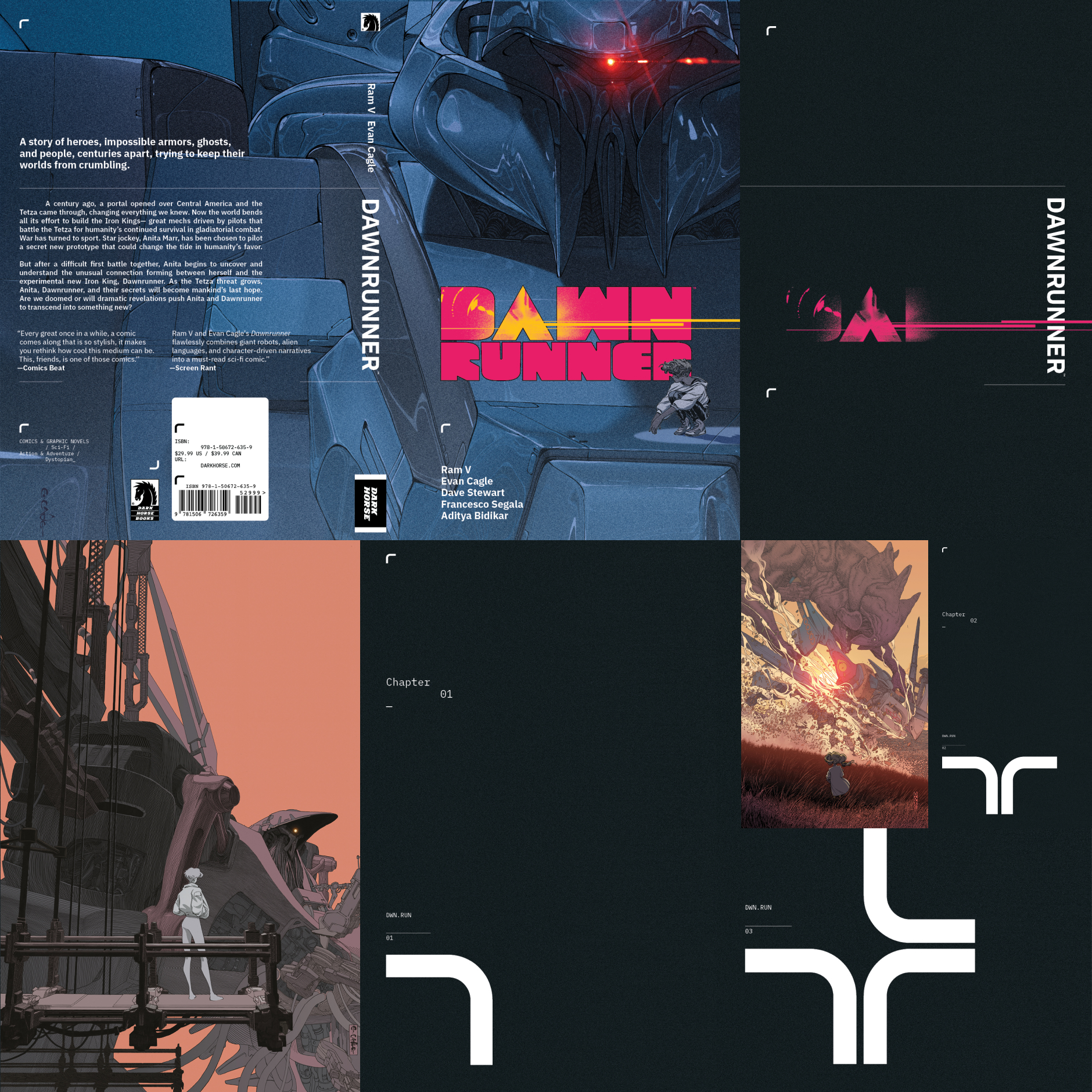
Book design for the crittically acclaimed Dawnrunner by creators Ram V and Evan Cagle. The book design builds a “DAWNRUNNER OS” design language — fully typeset in IBM Plex Sans — around Evan Cagle’s art and original series logo; creating a minimal publication design for the cover, and interiors giving the book a unique look, finished with spot gloss cover details.

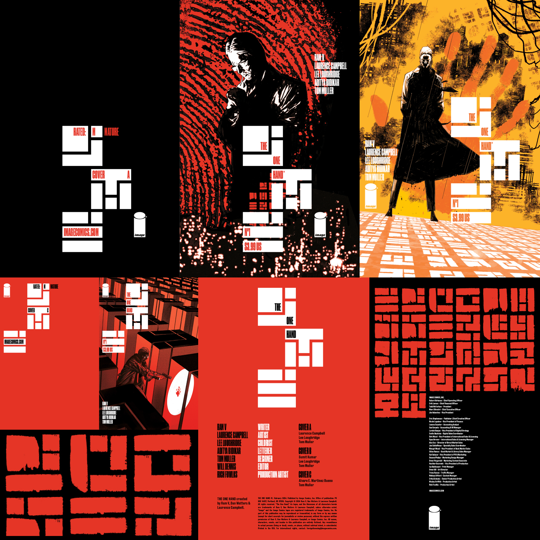
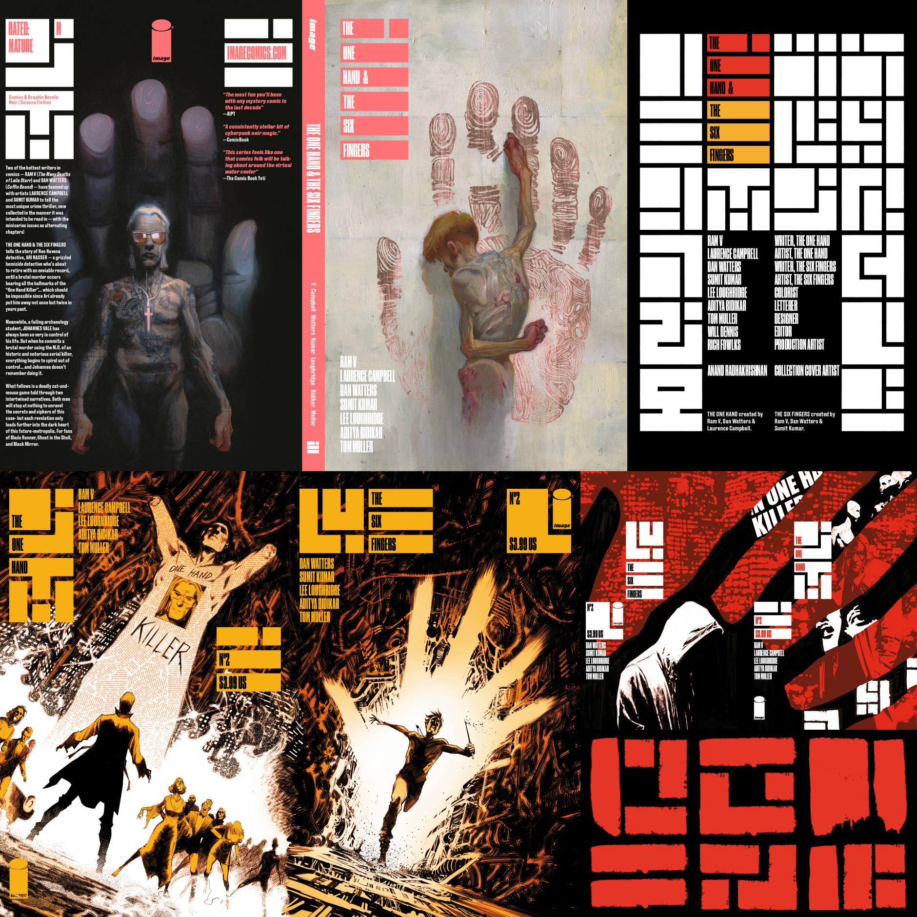
Publication design for the award-winning futuristic crime thriller(s) The One Hand by creators Ram V and Laurence Campbell, and The Six Fingers by creators Dan Watters and Sumit Kumar. Both series are mirrored narratives and interpretations of the same story, each told from the protagonist & antagonist point of view and connected through a shared design language built on a system of cyphers and a glyph grid designed to bind both storylines together.
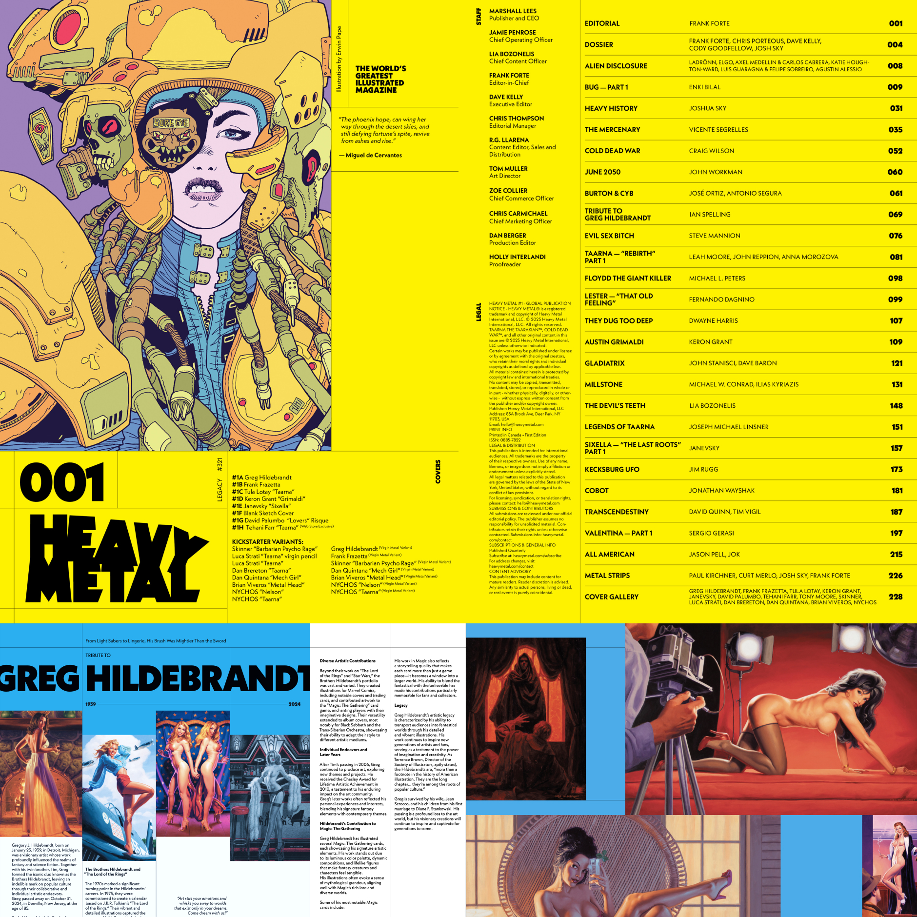
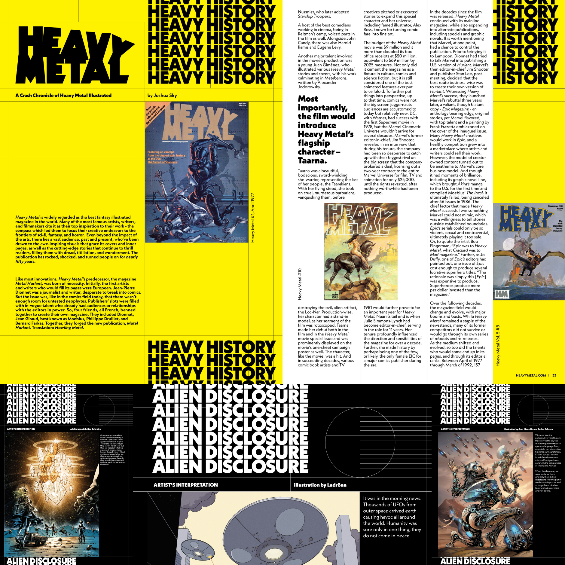
Since it’s inception in 1977, Heavy Metal magazine has been the standard in genre-defining sci-fi and fantasy storytelling. The relaunch in 2025 was an opportunity to evolve the magazine for the next generation of fans—bridging the gap between old and new, taking what made Heavy Metal great and pushing the design into the future, embracing its cultural heritage and modernising it for the next generation.
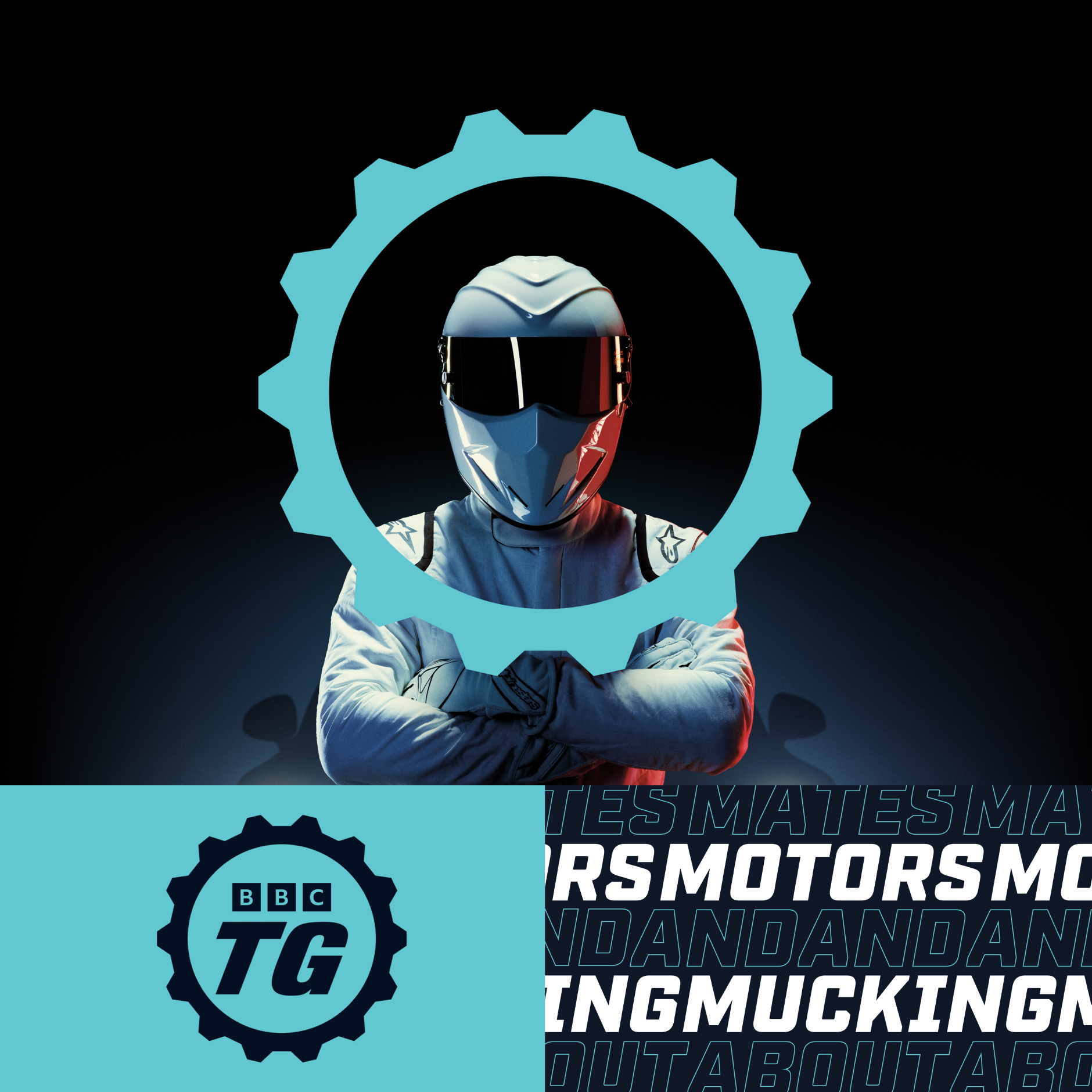
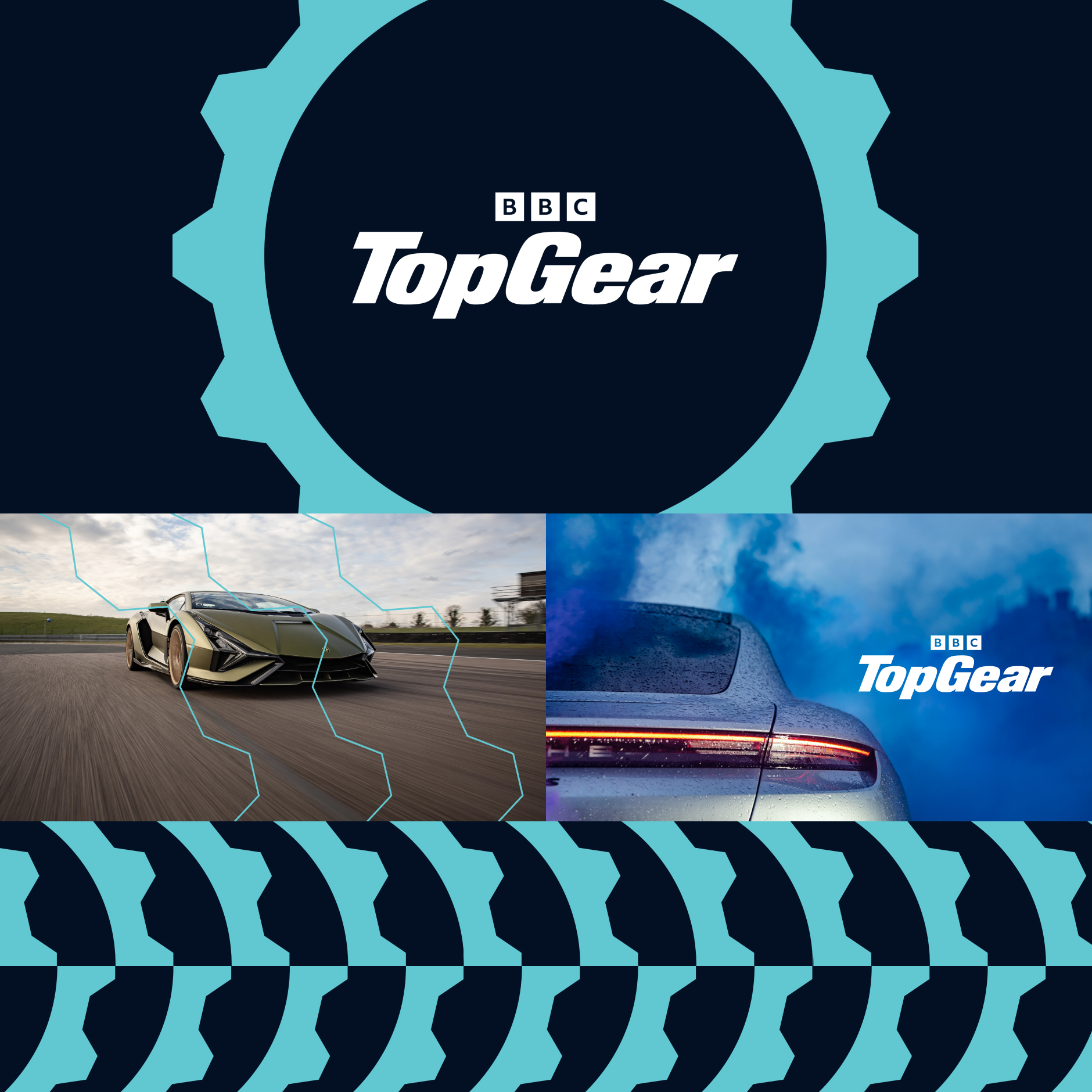
Refreshing the brand for one the most beloved TV programmes in the world was a feat of precision engineering. A finely retuned word mark and new monogram take pole position in a new identity system that heroes a new, optimised, iconic cog — giving Top Gear-heads a modern and future-forward brand that goes from 0-100 across all touch points.
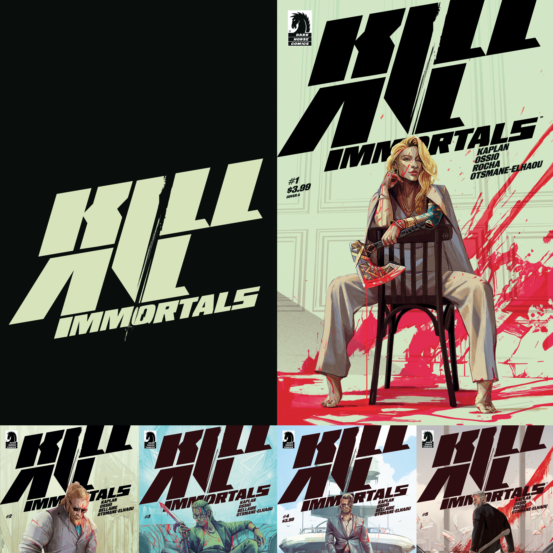
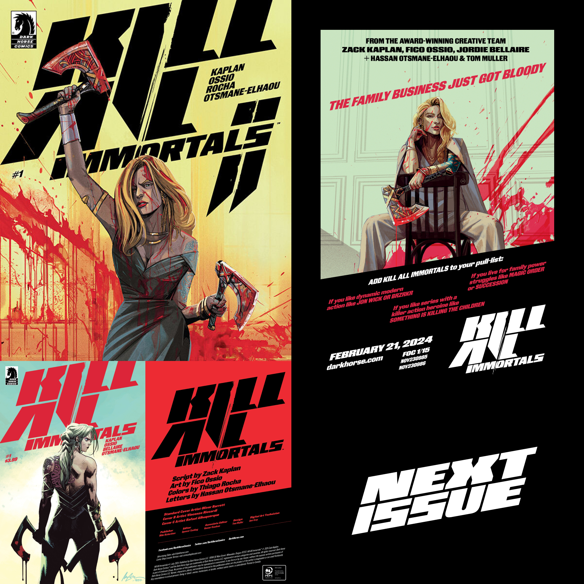
A bold and distinct visual identity and publication design for hit series KILL ALL IMMORTALS from Zack Kaplan and Fico Ossio — leaning heavily into the action film vernacular that captures the energy and mayhem of immortal Vikings fighting for the family business.
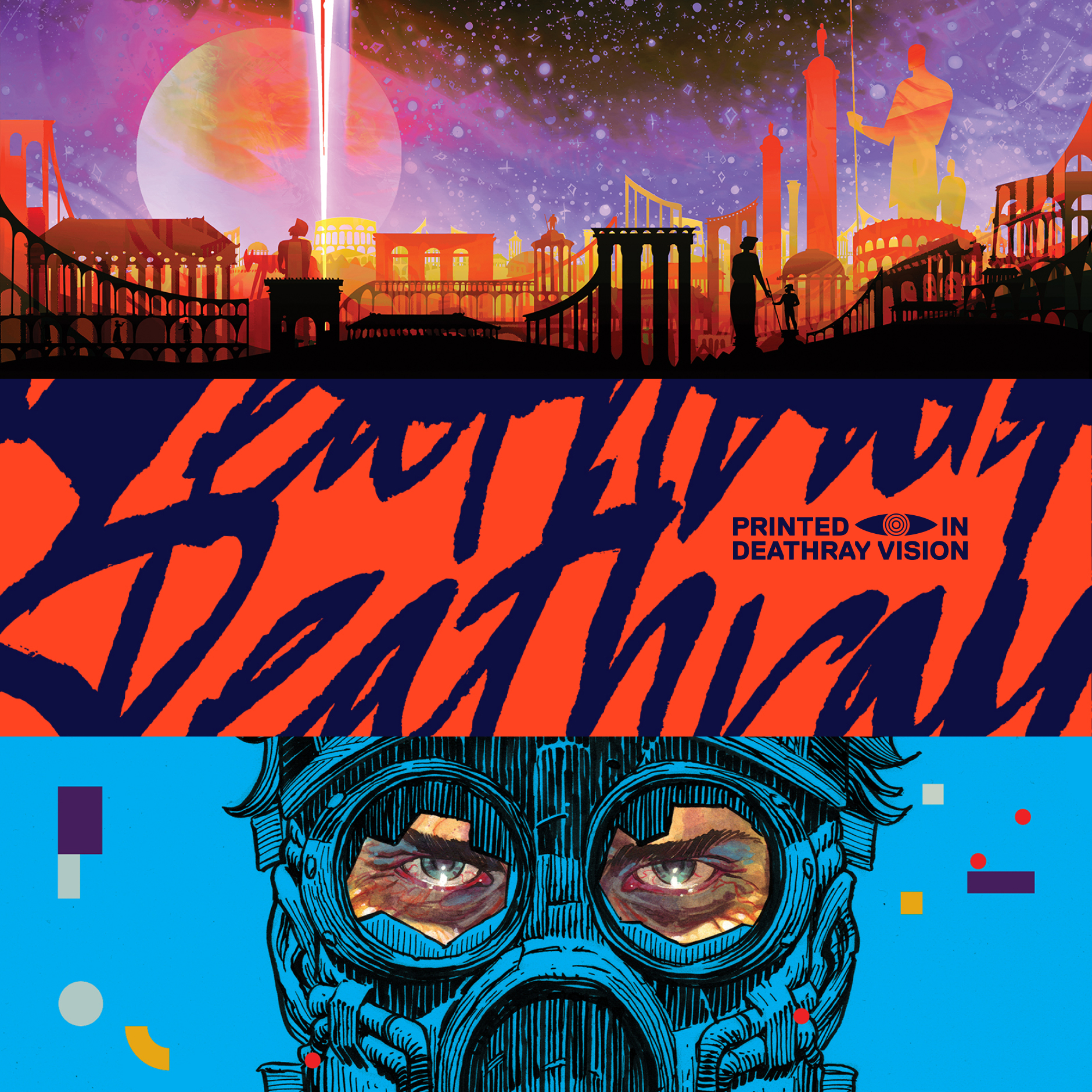
Publication design for Deathray's inaugural release, graphic novel The Roman Stars from creators Iván Brandon and V. Gagnon — and interstellar Roman epic that required a widescreen design treatment to capture the scale of the story.


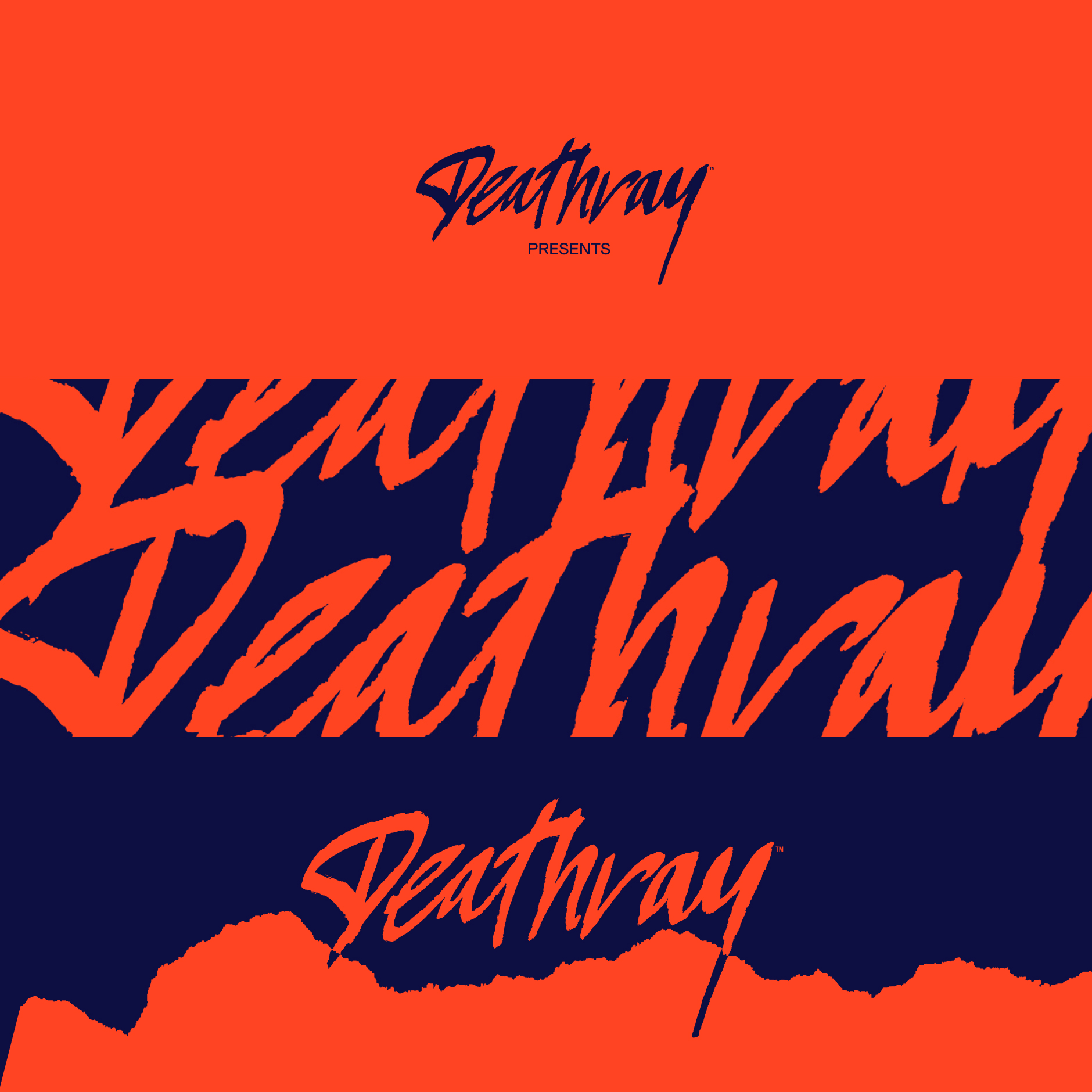
Visual identity for independent publisher Deathray. Mixing a punk DIY ethos with high end production values and unique stories, Deathray harnesses the power and reach of Kickstarter to publish unique stories in collectible formats to the discerning reader.
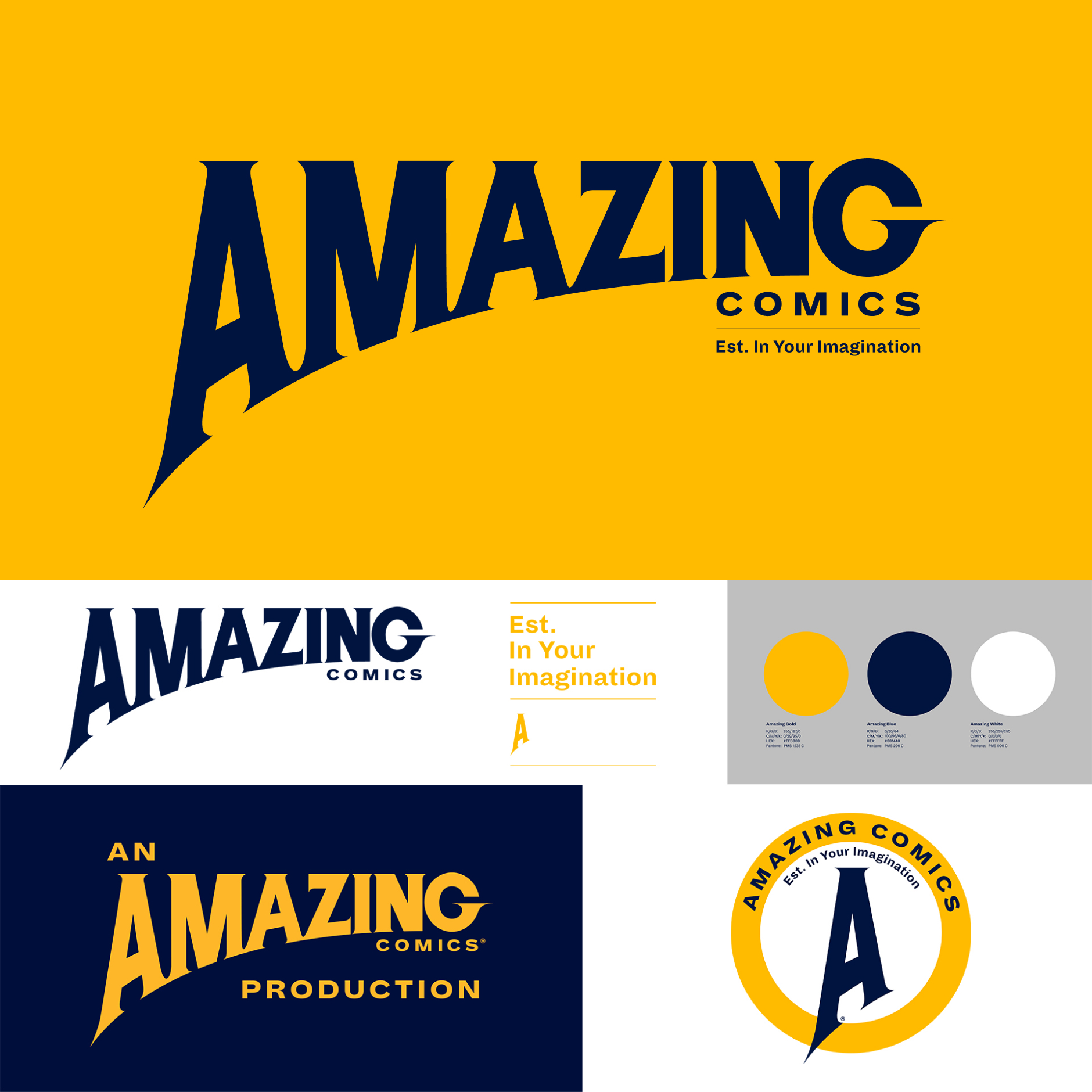
Logo and visual identity for Amazing Comics, the new publishing venture of artist, writer and former Editor-In-Chief at Marvel Comics, Joe Quesada. Working with top tier creators from film, TV and comics. The identity and logo revolves around a bespoke word mark that embodies the excitement and thrill of classic comics while embracing a bold vision for Amazing storytelling.
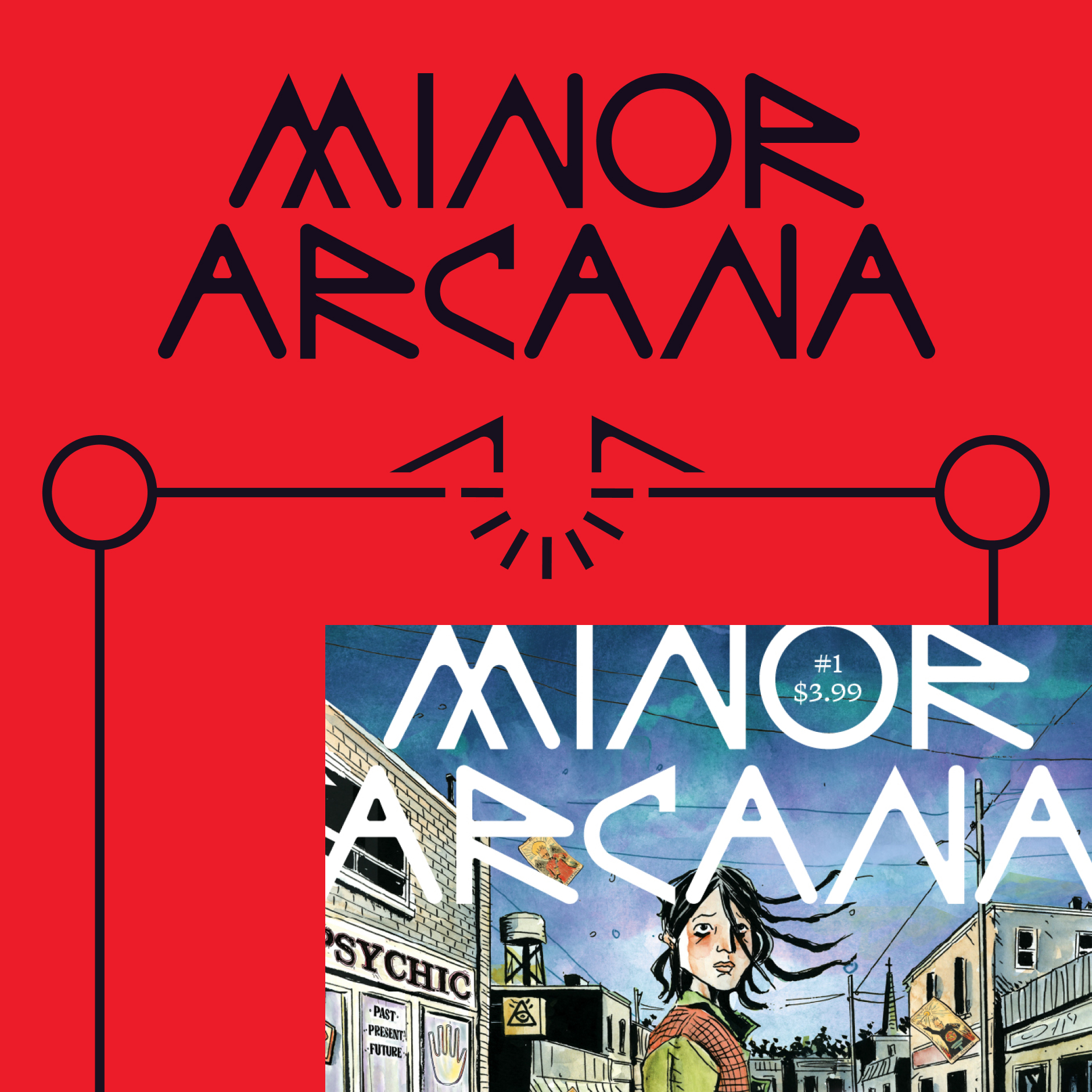
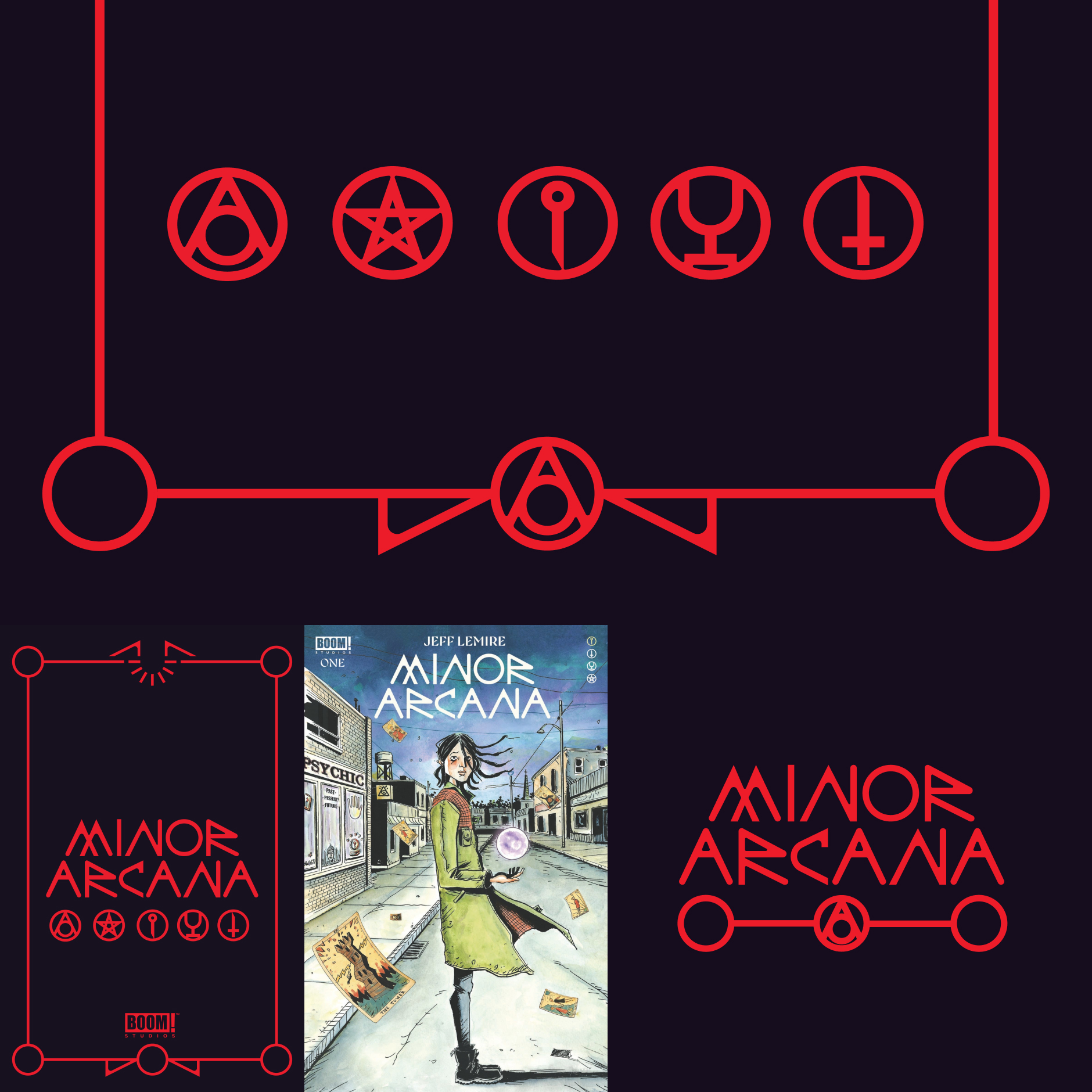
Logo design, symbols and tarot frame design and identity for NYT best-selling author Jeff Lemire's series MINOR ARCANA fro, with publication design by Boom! Studios' Grace Park. The series is mirroring the tarot deck; and the framing and symbols correspond with the arcs: The Book of Wands, The Book of Swords, The Book of Cups, and The Book of Pentacles. The logo and graphic language is a contemporary take on the traditional Tarot visual language, setting the stories apart in occult stories.
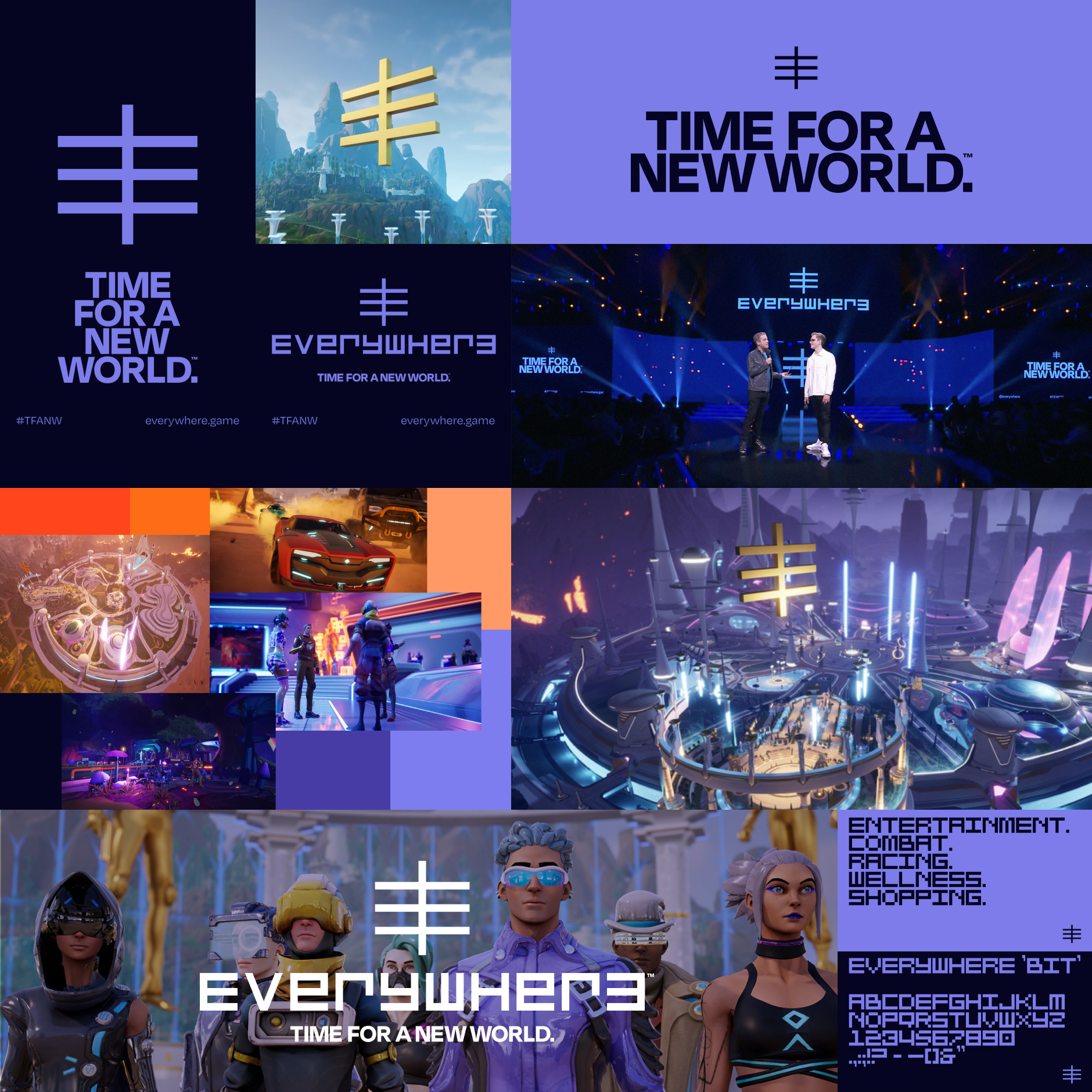
A modern, timeless identity for the upcoming game & platform Everywhere created by Leslie Benzies (ex Rockstar North, GTA franchise) and his new studio Build A Rocket Boy. Built on a flexible design system the identity, bespoke typography and motion language was built around an iconic symbol and logo that represents Everywhere — giving the game a unique identity that cuts through the noise.
Time For A New World.
(Motion graphics by Silver Machine Studios.)
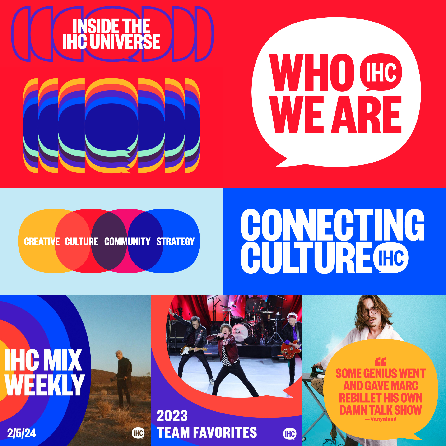
A dynamic and future-proof visual identity for creative agency & content studio IHEARTCOMIX (IHC). With roots in music, pop and visual culture the company is known for staging immersive events and creating original IP — from film activations to fan-favourite Amazon programming. Evolving their brand, the new identity reflects the fun, excitement and engagement they bring to fans.
(Motion graphics by Vandivision.)
A selection of logos, mastheads and graphic marks for clients in publishing, film, technology and entertainment: Marvel Entertainment, DC Comics, Sony Pictures, WIRED, Google, Image Comics, Valiant Publishing, Darren Aronofsky, Tori Amos, Ashley Wood, et al.


The biggest game in the Elder Scrolls franchise celebrates its 10th anniversary—and to mark this milestone a new definitive edition of the game was released alongside other anniversary initiatives. This called for a bespoke treatment of the iconic Dragon Mark, identity guidelines—and game packaging that celebrates the Skyrim legacy and the millions of fans worldwide.


Article for Google Fonts Knowledge that shows designers how they can go from font to logo. Imagining a speculative future Moon mission as its subject, the article is a deep dive into the creative process of developing a visual identity starting from existing typefaces in the Google Fonts library—from sketch, type selection, and design to the creation and application of the final logo.


My Domestika course captures my full creative process — from that initial idea to the final design. I teach not just my way of working; but the creative approach and the thinking behind my work. From the X-Men rebrand and my work on numerous comics I show how to translate powerful stories into memorable brand identities with a unique narrative spin using Adobe Illustrator and InDesign.

Cover and publication design for the critically acclaimed series Mazebook from writer and artist Jeff Lemire (Netflix’s Sweet Tooth, Essex County). A bespoke "Mazebook" logotype that mimics the angled, hesitant movements of someone drawing a line through a maze follows the narrative thread of a father searching for the memory of his daughter within an unfinished maze from her journals.
A limited edition was designed turning that idea into a physical object, taking the reader along with the protagonist. The cloth cover features the embroidered logotype as a continuous path from the back into a foil-stamped maze on the front cover.


Logo and cover design for Belgian publisher Dupuis, one of the largest (and oldest) publishers of Franco-Belgian comics and graphic novels—to launch 3 new titles that stand apart as fresh and contemporary stories in their legendary catalog.
Breaking with the traditional cover design for Bande Dessinées, a modern cover design language was developed for all three titles, including logos for In Memoriam and Vermines, and refreshing the existing IP branding of Italian title Nero for the French language market.


Best of 2000 AD brings the best stories of the iconic British weekly magazine to the American market. The first new title 2000 AD has released in 30 years, the publication needed a brand new design language that builds on the heritage, filtered through a contemporary lens for a modern audience. Launched to wide acclaim, the first issue has already gone through multiple sold out printings.


When Marvel initiated an ambitious relaunch of their X-Men franchise in 2019, they required a new creative direction that touched on every aspect of the line, signalling a new Dawn of X.
Building on a new “X” brand mark a comprehensive publication program was developed that included bespoke typography, logos, book and cover design—resulting in increased brand awareness and engagement through a unified brand system built in the language of X. People have the tattoos to prove it.


As part of the line wide rebrand of Marvel's X-Men franchise a bold new treatment was developed for it's various book product lines. Built on the foundations of the "X" brand mark, each line has a distinct identity within the larger family, sharing the same design DNA, building a strong and visible presence in retail locations—from the monochrome Dawn, Reign and Trials of X softcovers or the distinct colour blocking of the individual series paperbacks—making sure that X marks the spot every time.


Beyond the standard softcover paperback collections, the X-men franchise collects key storyline events in deluxe, oversized hardcovers before being released as mass market paperbacks. As with the other product lines, these books share the X design DNA throughout, where subtle recurring design motifs, including the use of 6 colour printing, create a visual cohesion across books that thematically stand apart.


A key element in the X-men franchise rebrand was to develop a brand new suite of logos for the various titles that would be released as the product line grew. Rather than retreading the classic approach where each title has a logo that stands in isolation, a bespoke typeface—X Display—was developed to form the basis of a shared typographic approach, giving all X titles a strong unified brand presence.


When Marvel's X-men line was entering it's Destiny of X story phase, and opportunity arose to revisit the franchise rebrand and update the look of the product line, making it even more distinct from the other titles Marvel was publishing by reimagining a classic cover device for a modern era: the corner box.
Especially popular between the 1960s and 2000s, comic book covers utilised corner boxes as a device to highlight characters, issue numbering and pricing. Having virtually disappeared since, they were revived as part of the X-Men brand as a flexible and modular component giving the X-Men titles a unique signifier in the marketplace that has been a brand asset on all X-titles since.


Variant covers are issues of comics printed with multiple covers, each with unique cover art usually released in smaller quantities as the primary cover, aimed at the collectors market and incentives for retail and fan interest. With the relaunch of the X-Men line and subsequent releases of new titles a collection of "Design Variants" were designed, replacing the usual cover art with graphic "Mutant DNA" patterns and typographic data, bringing a unique collectable design-led aesthetic to Marvel's mutant family.


Product and merchandise design for Mondo celebrating the House of X and Dawn of X relaunch of the X-Men comics. A limited edition slipmat and enamel pin were designed showcasing the new branding of the X franchise.


Logo and visual identity for Hivemind, the entertainment company behind The Witcher franchise (Netflix), and The Expanse (Amazon). With adaptation in mind, the bold and iconic identity effortlessly moves from Twitter avatar to IMAX screen—stamping a unique mark on their work.


A versatile and modern logo 'five minutes into the future' was required for antagonist RST (Rising Spirit Technologies) which would be used throughout the film to bring the RST corporation to life — from decals on coffee cups to applied graphics on uniforms and on-set environments. Vin Diesel approved.

Go-Be Sleeves is a New York based startup who create eco-friendly antimicrobial airplane tray table covers, giving travellers extra protection against bacteria and germs. The brand and identity extend their trademark honeycomb packaging (itself a symbol of a protective grid) through a friendly and open logo and mark that highlights the act of covering and protecting your loved ones, supported by a graphic suite of assets that allows Go-Be to create an approachable visual language that celebrates travel.


Publication design for the award-winning graphic novel by Ram V and Anand RK, marrying graphic rhythm and discordance for a haunting jazz tale.


A design system for a world in which war has become a commercialised spectator sport and where celebrity soldiers vie for fame, profit, and the glory of their sponsor nations.
A distinct visual language was developed to bring the world of VS—created by Iván Brandon & Esad Ribíc—to life, visualising the pervasive stream of reality TV transmissions, celebrity sponsorships, product placements and broadcast graphics that are part of, and drive, the narrative.


Logo design for Marvel Comics' Stormbreakers Artist Program, which recognises and spotlights the industry’s top rising artists from around the globe as "The next generation of elite artists."


Inspired by both the Constructivist, hyper-utilitarian graphics of BLAST magazine and Pop Art Americana, the graphic packaging of The New World—created by Aleš Kot & Tradd Moore—is purposefully minimalist opposite to the maximalist art— creating a contrast that lets the story shine through a bold, singular design language.


Bringing translated editions of primarily YA English language graphic novels to the French market means the real estate where the brand lives is small and needs to compliment the original material, yet stand out as a brand.
The name is a play on the French pronunciation of “Keen Eye”—reinforcing the publisher's discerning selection of only the best stories from top-tier creators. This idea forms the cornerstone of an expanding publication design framework that also includes the anthology title PUNCH!—showcasing YA Franco-Belgian creators—giving the publisher a strong presence in the market.


Days of Hate—created by Aleš Kot & artist Danijel Žeželj—is set in a bleak America five minutes into the future: a nation beset by bigotry where white supremacy has turned the country into a police state. Reflecting this through design and priming the reader for the experience, an austere publication design was developed that taps into the visual language of Agitprop and protest, adding a layer of graphic urgency to the story.


Set in a near future where motor racing is ever present through the World Grand Prix (WGP) racing league and night-time bike wars for Crush — an illegal machine narcotic — the world of Motor Crush—created by Brenden Fletcher, Babs Tarr & Cameron Stewart—needed a design experience to bring to life the omnipresent broadcasting of WGP throughout the story and the publication design.
Modular 'WGP information stacks' became the motif for the publication design of the series and books — presenting the story into a hyperkinetic and multi-layered 'broadcast' package wrapped into the visual language of a futuristic motorsports event.


Logo design for various DC Comics titles across the various publishing imprints: DC, Vertigo and Young Animal.


A graphic language representing lost messages, inspired by the modular quality of the Baudot code, form the basis of a publication design package for Drifter—created by Iván Brandon & Nic Klein—designed to adapt over the course of the story, from a vague signal to a clear message, following the evolution of the characters.


How do you create consistency when there is none? By constantly redesigning the identity to reflect each artist. This was the concept behind the publication package for ZERO—created by Aleš Kot— which grew and changed naturally over the course of it's run. The publication design was reinvented each issue, giving the series a unique presence in the crowded landscape of comics.


Image Comics is the third largest comic book publisher in the United States and the leading publisher for independent creator-owned comics. Working with critically acclaimed creators, stories are brought to life by applying branding and design as integral elements of the story experience—elevating what graphic design and can bring to sequential narratives in comics and graphic novels.


Valiant Comics were having a creative renaissance and were looking to translate that into bold, eye-catching covers that would stand out in the market place—from redesigned series logos and cover design—to creating impactful digital cover art setting apart the publisher from the competition.


Contribution to the THE THING: ARTBOOK, celebrating the 35th anniversary of John Carpenter's sci-fi/horror classic film "The Thing".


Typographic poster, visualising a key scene from Denis Villeneuve's Blade Runner 2049.


"We're doing a feature on internet security and need the magazine masthead to look like it's data is corrupted".
That was the initial brief for what became an iconic and award-winning cover.
In addition to delivering the custom masthead designs, 'corrupted' graphics were created as visual markers within the editorial feature. It wasn't until the issue came out that it became clear the 'internet security' feature was a landmark interview with Edward Snowden, which had been secretly in the making for over a year.
The rest as they say, is history.


Coinciding with the release of Darren Aronofsky's feature film "Noah" in theatres, the graphic novel—based on an early draft of the script written by Aronofsky and producer Ari Handel—was released in a deluxe hardcover format and a special limited edition of 300
Rather than following the film's branding, the book's design and iconography stands on its own, with a timeless iconic mark and graphic language inspired by religious texts and illuminated book design.
Working closely with Darren Aronofsky and co-writer Ari Handel, the book's design brings the story's vision to life in an understated, yet powerful way — updating the biblical story for a modern audience.


Identity concept for a proposed documentary series that would spotlight comic book illustrators and artists—the titular heroes of the series—and follow their creative path and career.
A modular graphics and identity package was developed inspired by comic book panels, framing the narrative and marketing for the proposed series.


Logo and visual identity system for the leading comic, movie and geek news platform Comicbook.com. Visually the identity refines the brand's established core colours and places a star—a key graphic in their popular review ratings—in the eye of the reader, formed by the 'cb' monogram.


International marketing campaign bringing to life the facts and figures behind the film as a suite of social content, visualising the highs and lows of Jordan Belfort’s life as the "Wolf of Wall Street". Adapting the visual style of the film marketing, an extensive modular infographic was designed—inspired by early 90s financial tickers and teletext screens—creating a visually impactful suite modules that were seeded as shareable graphics, GIFs and video.
Universal even managed to get a few printed editions signed by DiCaprio and Jonah Hill, which proved a hit with local partners as competition prizes. Apparently DiCaprio requested three copies for himself!


Logo, one-sheet and marketing design proposals for Harmony Korine's film Spring Breakers. Ultimately the production studio pivoted into a different direction and these ended up on the proverbial cutting room floor.


Official movie poster for Terminator 2: Judgment Day for StudioCanal in collaboration with Mystery Box Studios.


Alternative film posters, some commissioned by magazines, some self-initiated.


Logo and visual identity for mobile team-up sci-fi shooter LAST GUN, developed by indie studio The Giant Machine. Characters battle each other on rotating platforms which double as health indicators—becoming the hero mark of the game's identity, supported by a dynamic word mark.


Visual identity for the Global Fashion Awards, organised by the world’s #1 fashion trend forecaster, WGSN. When the awards came to London in 2012 and 2013 a new logo and identity was developed and delivered as a design system and toolkit for the WGSN team — touching on every aspect of the events, including the award itself.
The resulting brand was far removed from the expected 'luxury' visuals and delivered a modern and refined identity that set the awards apart in the fashion event calendar.


Immersive digital campaigns for the biggest blockbusters and cult TV shows from StudioCanal, Paramount Pictures, Universal Pictures and Warner Bros., extending the fictional worlds of film and TV into interactive games and stories for fans to explore.


Redact was a peer to peer encrypted messenger app that avoided sending messages through a central server; giving users much more encryption control over their communication. The visual identity and UI design for Redact utilised the archetypal motif of redacted documents as the building blocks for the logo and UI design in the messaging system, lending a sense of "spy-tech" to the user experience to what The Independent newspaper called the "James Bond style messenger app".


Zonza was created by WPP production company Hogarth Worldwide as a next generation Enterprise SaaS Digital Asset Management service—and became a key delivery and transcreation platform used globally by WPP network agencies and their clients.
As a new platform, the Zonza visual identity—built on a series of RGB slash symbols— and full product experience needed to stand out from the industry competitors, whilst immediately looking like a trusted and established product. This was achieved by designing a modern, atypical UI design system that put the brand first. A full digital toolkit and guidelines for the Zonza web application were created, including direction for the customer-facing dotcom site that acts as a first point of contact for new customers.


Various digital illustrations for WIRED Magazine's US and UK editions, brining to life articles predicting the impact of the iPad (still unreleased at that time), Netflix, and brain hacks featuring Steve Carell.


Mam Tor Event Horizon was the award-winning flagship anthology of British independent comic book publisher Mam Tor. A spiritual successor to classic Omni magazines, Heavy Metal and 2000 AD anthologies, the title positioned itself as a home for the best of New Weird and Sci-Fi for the 21st century.
As well as identity for the publisher, the ambition of the title was reflected in its branding and publication design: unexpected and unapologetically looking to the future, marrying clean typography with discordant graphics, earning the title a dedicated fanbase and critical acclaim.


Logos, publication design and visual identities for various IPs created by artist Ashley Wood—spanning graphic novels, comics and toys—including Popbot, World War Robot (WWR), Tomorrow Kings and many more.


If you've made it all the way down and are still hungry for more, take a deep dive into the project archives and uncover work for Tori Amos, Sony, Laurence King Publishing, DIESEL, Getty Images, and many more. Enjoy!


